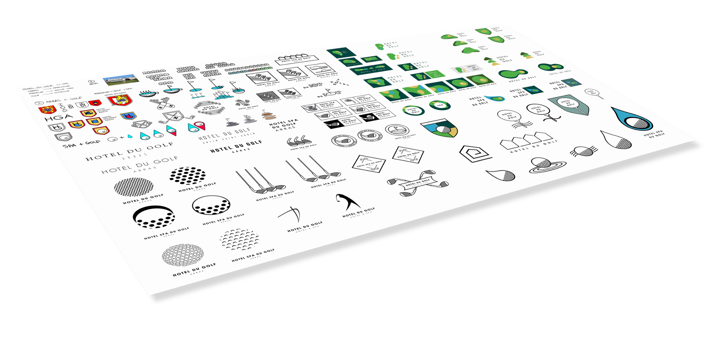
Explore the universe.
Our client approched us with a need for a golf-themed hotel logo. We were excited to work within such a rich universe. Golf courses, gears, flags, greens, balls and so on are as many elements we were about to play with, explore graphically to create a catching logo.
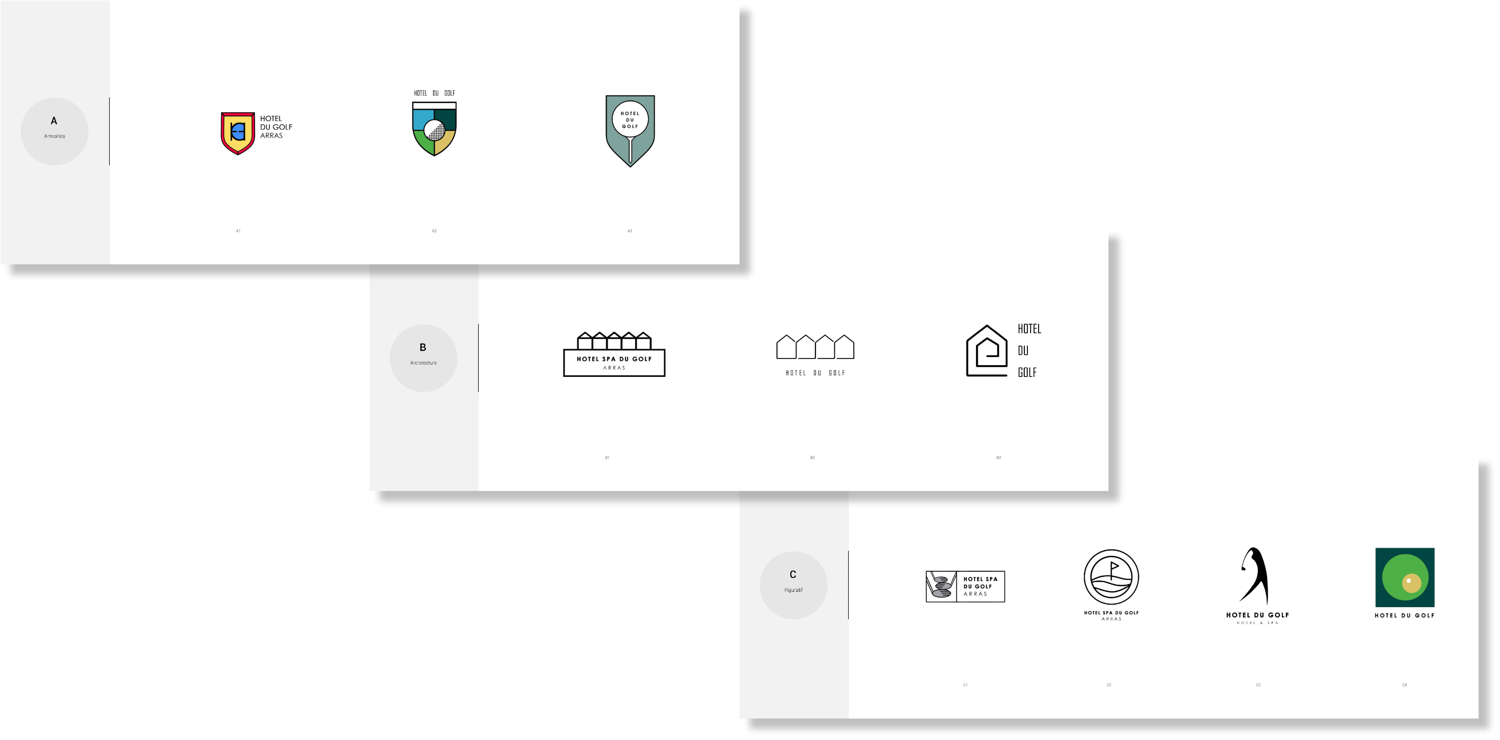
THROUGH THE FUNNEL
Three clear themes, respectively based on the city's emblem, the hotel's architecture and the golf itself. The client's decided to go full-on golf and picked the third theme.
FINAL CHOICE
The final choice went towards the stylized golf player silhouette, clearly evoquing the sport itself with a touch of class and dynamism.
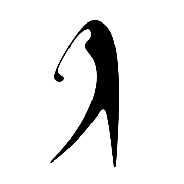
REFINEMENT
Once the final choice has been made, we went through one more step of refinement to make sure it's as good as possible, trying out different attitude.
CHOICE OF FONTS
Extremely important, they can chance the feel of a logo. We proposed 3 different approches : a neutral, a bolder and a classier serif one. The client picked the neutral one.


Large

Small
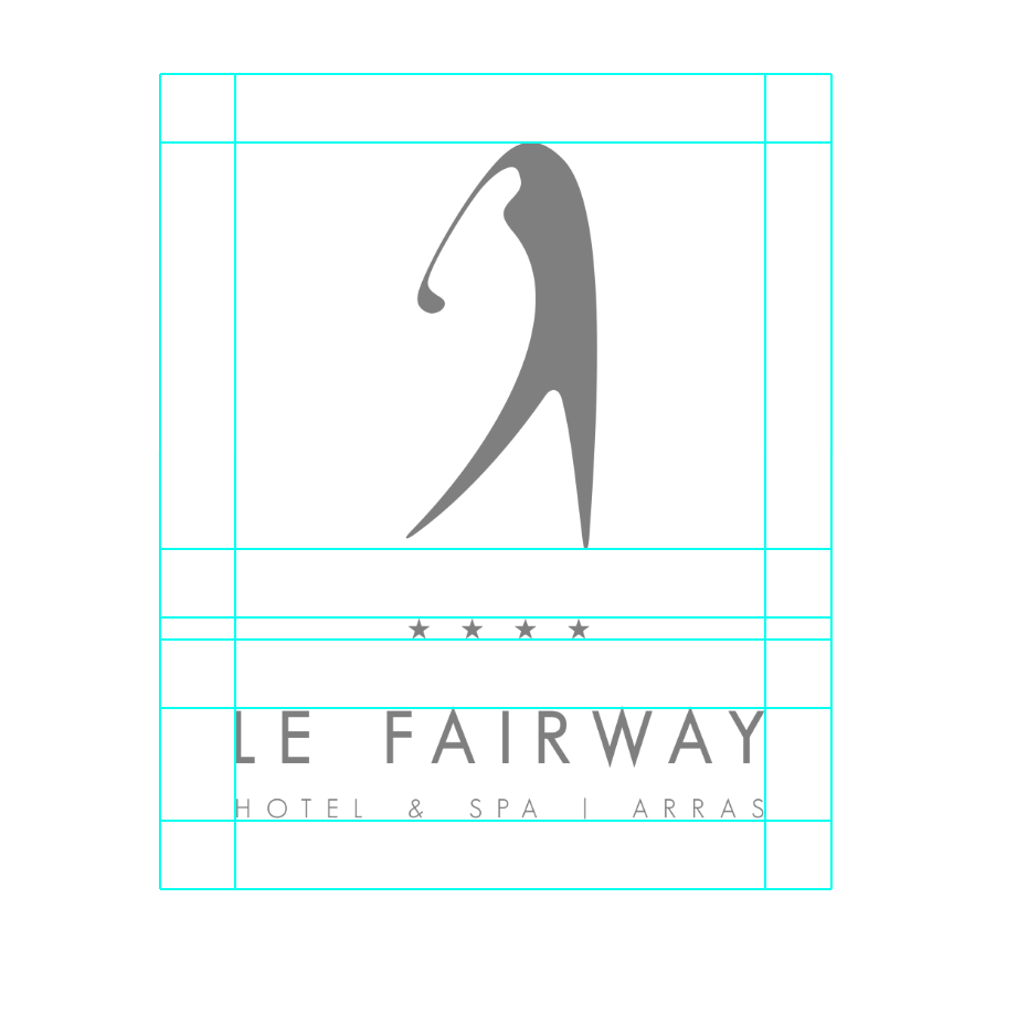
BREATHING AREA
The logo will be used in various places, the breathing area makes sure it will always stand out.
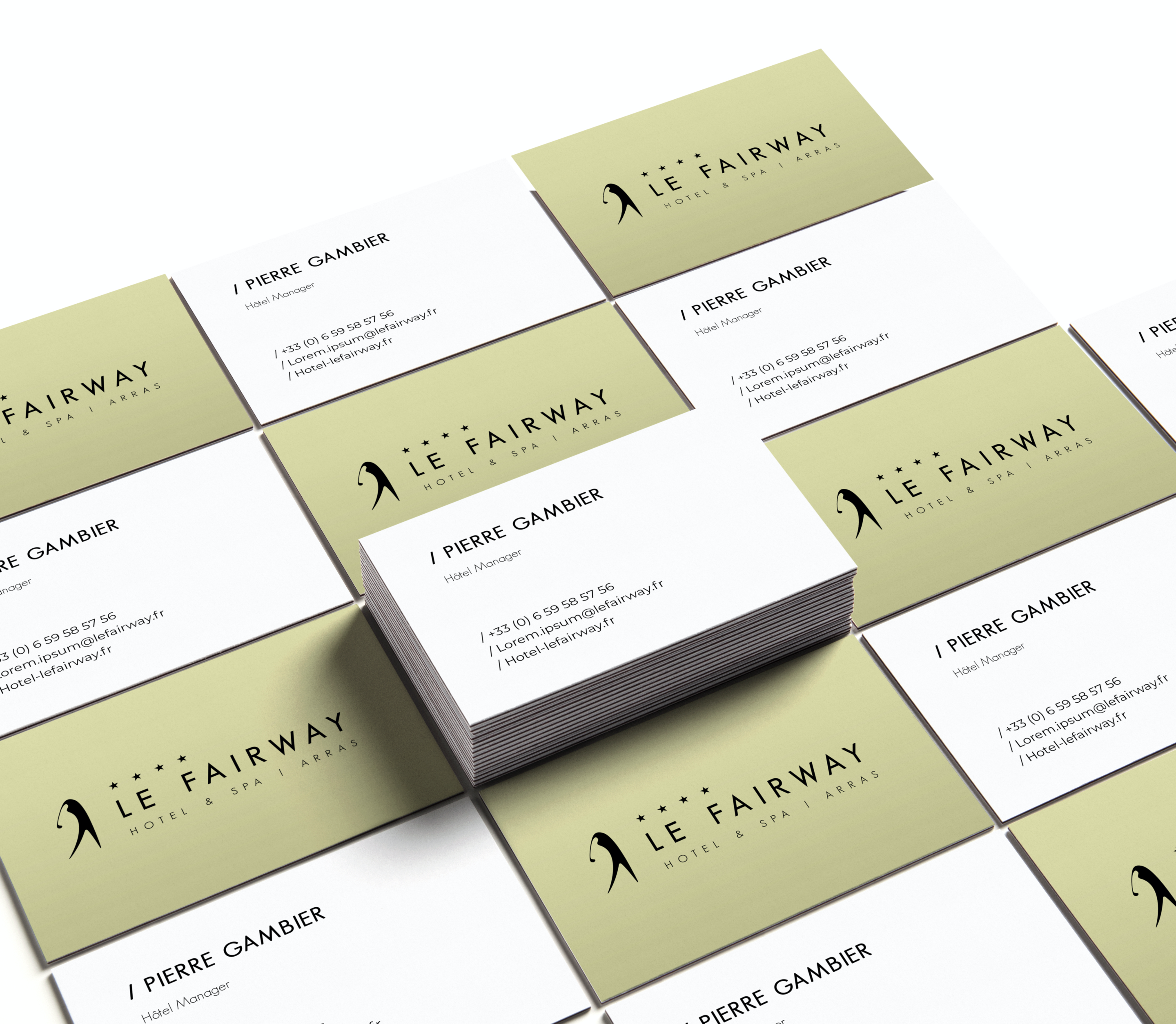
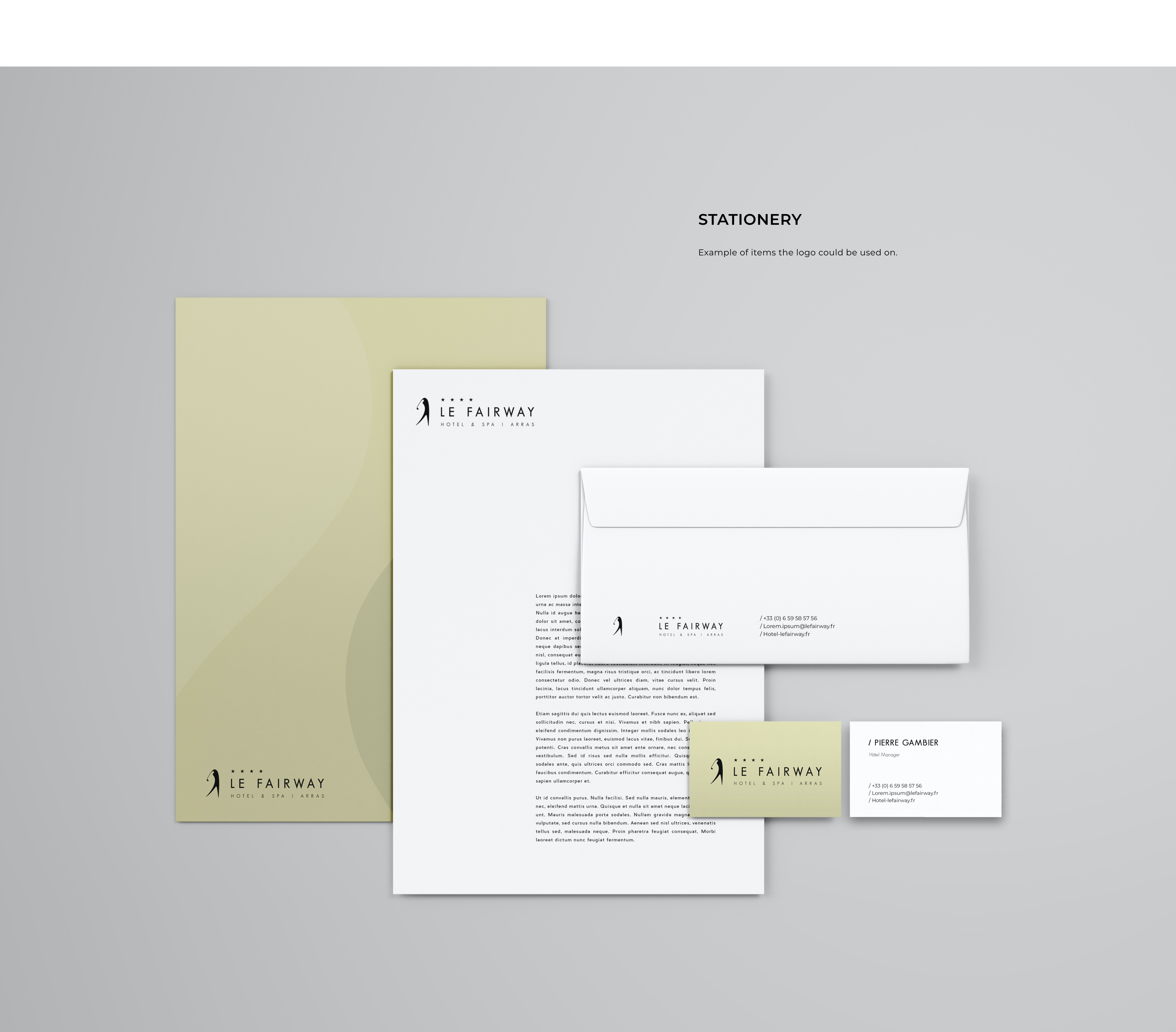
ONE STEP FURTHER
Final imagery and mock-ups to sell the logo and its potential